Corporate Identity Design
corporate identity design
Brand identity is a promise to the customer. That promise may involve product quality, service, price or various other things. Brand identity is the reason you offer for your customer to choose you instead of your competitor.
A strong and distinctive brand identity can position a company above its competition. But having a brand identity that is strong takes time and effort to develop. It’s not as simple as just redesigning a logo or rewriting a tagline.
Orient Design – a cross-disciplinary design firm based in Singapore – has helped companies both big and small to develop, maintain, refine, and strengthen their brands. Successful re-branding involves evolution, not revolution. Your new brand is not just a new and improved version, but must strive to strengthen emotional ties and customer loyalty. An old brand doesn’t have to mean an aged brand – it can be re-worked or re-branded for it to stay fresh and relevant.
At the end of the day, having a brand identity that resonates with your target market is the most crucial factor. Here are case studies of how we have helped refine or transform brand identity which impact customer needs and desires.
corporate identity design: CMK
Pt Citra Mandiri Kencana (PT CMK) is an established premium importer and manufacturer of pet food and animal feed founded in 1985. CMK is one of the leading companies in agriculture and aquaculture sector. With their expansion in progress, we are honoured to be part of it; in-charge of the entire rebranding and upgrading of their company image. This includes the upgrading of several brands under the big umbrella of PT CMK. They are namely, FANCY, BEAUTY, BEAUTY (Bird) that we performed a brand and packaging upgrade.
Scopes of work:
Market Research | Brand Logo | Brand Identity | Interior Design Concept | Packaging Design System | Website Template
Market:
Indonesia
corporate identity design: Deutschem
Chemistry brand design. The idea of the logo came from chemical bonding in between molecules. Different coloured circles represent the different chemical element in the molecules. And the molecules are position in a certain angle and manner which forms a “D” & “C” within.
Scopes of work:
Brand Logo | Brand Identity
Market:
Germany

corporate identity design: Europaische
Inspired by the revolving action in coating process and German colour flag, leading glass chemical coating company Europopaische identity is refreshed. The colour has also been replaced black with green to express the belief in environmental friendly product. These had crafted the industrial tension into iconic and distinctive look, evoke attention and express brand spirit.
Scopes of work:
Brand Logo | Brand Identity
Market:
Germany

corporate identity design: Kindly
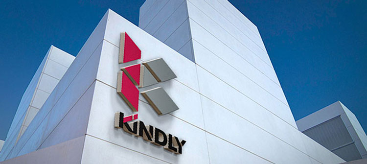
The brand identity reects Le Corbusier’s modular concept which established the fundamental of modern architecture. It is also manifested in a three-dimensional fashion, the letter “K” takes form with three converging axises. These elements are to position Kindly as an insightful, modern and pioneering construction solution provider in the industry.
Scopes of work:
Brand Logo | Brand Identity
Market:
Singapore
corporate identity design: VT Group
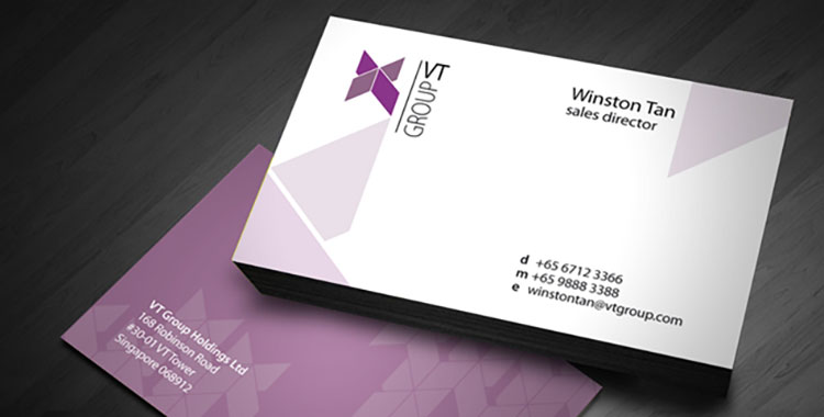
The key idea in VT Group brand identity is combining the two letter from the brand name. As VT has a wide investment target, the logo request to be flexible, therefor we introduce using strong typography treatment to differentiate their range. Finally, unusual purple colour helped VT Group standout on the market and create a neutral but professional touch for the brand.
Scopes of work:
Brand Logo | Brand Identity
Market:
Singapore
corporate identity design: Brilliant
original logo was dull and had a rigid, rectangular shape. To revitalise its brand image, we added curves so the brand name was encapsulated within an asymmetrical heart shape. Light blue swirls were added to portray a hint of a smile, with the dotted eyes completing a hidden smiling face. To complete the transformation, a bold, rich hue of blue was used bring out a younger look.
Scopes of work:
Brand Logo
Market:
Singapore

corporate identity design: LAYA
Inspired by the versatility and flexibility of a ribbon, the logo portrays the warmth of human touch with an Asian flavour. The project involved numerous site visits and refinements before achieving the final results. The final design was adapted for use in uniforms and corporate interior design.
Scopes of work:
Brand Logo | Brand Identity | Interior Design Concept | Packaging Design | Website Template
Market:
China

corporate identity design: Jackway convertor
Jackway Convertor is a manufacturer of flexible and customisable packaging materials based in Singapore. An extensive market study revealed that the old Jackway Convertor logo projected a dated image, in contrast with more sophisticated designs of the competitors. The final design is simple and futuristic, reflecting the brand’s forward-looking spirit and cutting edge attributes. The grey and red colour scheme brings out the ‘J’ in the logo, which resembles the drum of a printer and a plastic in print.
Scopes of work:
Brand Logo | Brand Identity | Environmental Graphic
Market:
China

corporate identity design: UberB
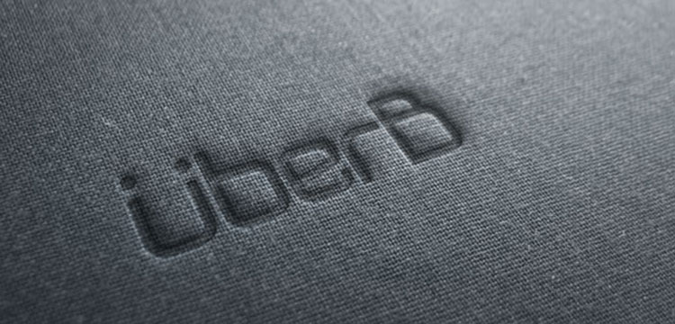
Brand revamp was needed to enhance the image of UberB company. The corporate imported German technology and produced unique electronic bed for Asia market. As a whole, the brand is designed to potrait the european elegant look and evoke emotion. Second graphic element is introduced t extend further product and range with out missing UberB essence and spirit.
Scopes of work:
Brand Name Creation | Brand Logo | Brand Identity | Website Template
Market:
China
automotive brand design: GSC
GSC has a great vision and expansion for the future brand. By sharing and understanding their vision, our mission is reshape their identity representative but maintain the brand spirit. We simplified the logo and retain the colour, created a modern essence and help them easily apply to product and future application.
Scopes of work:
Brand Logo | Brand Identity | Environmental Graphic | Packaging Design | Website Template
Market:
Singapore

Restaurant and gourmet store identity design: Premium Gourmet
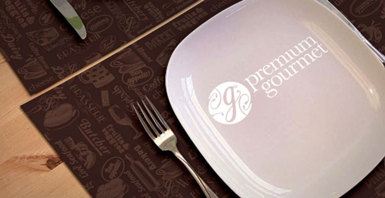
A brand revamp was needed to strategically establish its “premium” image and status for this store in the upmarket district of Ho Chi Minh city. Change of signage and application of department identities to project a standard of fine living and service were introduced along with store directory, furnishing, lighting, publicity material and packaging. The brand architecture was also devised to accommodate each department identity as a standalone sub-brand even outside the main location.
Scopes of work:
Market Research | Brand Architecture | Brand Logo | Brand Identity | Environmental Graphic | Packaging Design | Website Template
Market:
Vietnam
restaurant identity design: Firewoks
The Firewoks brand is designed to potray the bright, refreshing and vibrant qualities. It consists of several key elements: the wok, rays and unique logotype. A combination of warm colours; yellow, orange and red is chosen for its association with fire, which is an essential element in culinary.
As a a whole, Firewoks brand projects an array of asian flavours, taste and texture. Besisdes bringing a range of scrumptious dishes to our customers, we also strive to provide excellent service and quality. We are taking asian fare to a new high.
Scopes of work:
Market Research | Brand Name Creation | Brand Logo | Brand Identity | Interior Design Concept | Environmental Graphic | Packaging Design
Market:
Singapore

restaurant identity design: LUK YU Restaurant and Teahouse
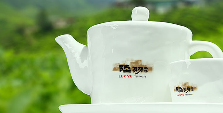
Drawing inspiration from the Sage of Tea, Luk Yu, Luk Yu Restaurant and Teahouse was born. An easy-going and passionate man, Luk Yu continues to inspire many with his (i/)The Classic of Tea(i/), which became a manual for anybody interested in tea. The poetic approach is displayed through its casual elegance in its logo and store concept, evoking a sense of repose and relaxation
Scopes of work:
Brand Name Creation | Brand Logo | Brand Identity | Interior Design Concept | Environmental Graphic | packaging Design
Market:
Singapore
restaurant identity design: Bao Today
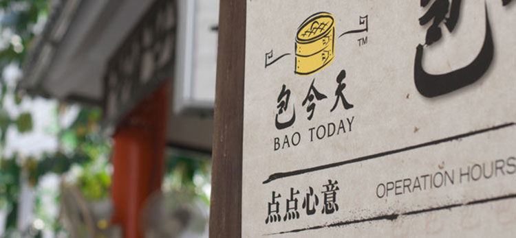
To the Chinese, eating bao (buns) and dim sum is part and parcel of their culture. So is the iconic Justice Bao, who was an outstanding government official in the Song Dynasty. We married this element into the creation of Bao Today’s logo, arranging bun steamers to look like an antique Chinese magistrate’s hat. The new Bao Today logo is quirky and modern, yet bears symbols which are close to the hearts of many Chinese.
Scopes of work:
Brand Logo
Market:
Singapore
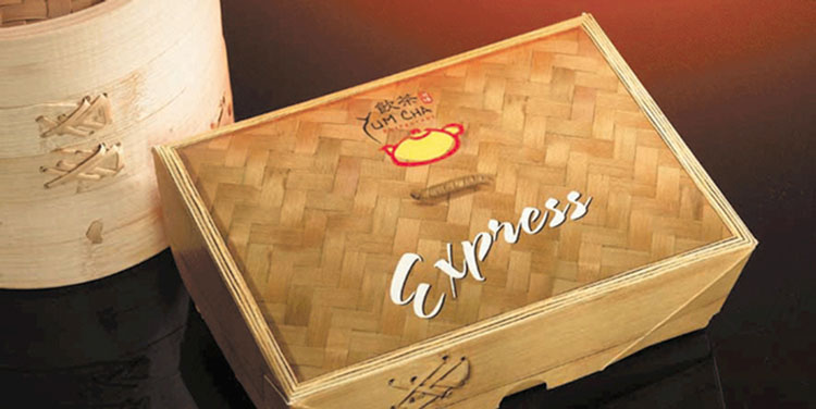
restaurant identity design: Yum Cha
is an award-winning Dim Sum restaurant located in the heart of Chinatown in Singapore. Its original logo was dull and dated, so our task was to rejuvenate their corporate identity. Using the literal meaning of the term ‘yum cha’ (which means drinking tea), we incorporated visual elements of a teapot and oriental colours like maroon and chrome, to give the brand a traditional look and feel. For their takeaway boxes, we imprinted bamboo textures onto the background to symbolise Chinese steamers, which are synonymous with Dim Sum delicacies.
Scopes of work:
Brand Logo | Brand Identity | Packaging Design
Market:
Singapore
bakery brand design: iBake
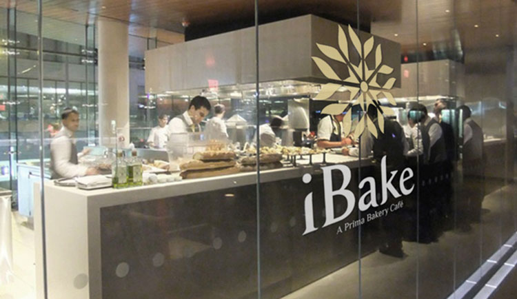
Prima’s new premium bakery is given a vibrant and contemporary look and feel. The stylised wheat kernels from the parent logo are shaped into a flower and incorporated into the iBake logo. The flower motif is derived from the word ‘flour,’ which originated from the word ‘flower.’ The flower petals spread out in 8 directions, symbolising the proliferation of iBake outlets around the region to satisfy the appetite for premium quality bread.
The grey and ochre colour combination reflects the products’ main ingredient, wheat grain. This also heralds the origin of the golden field of wheat and its superior quality. The logo type font matches the curves and flow of the main motif while maintaining a modern and clean image.
Scopes of work:
Brand Logo | Brand Identity | Packaging Design
Market:
Singapore
café brand design: 1983
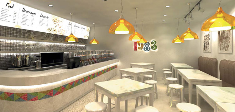
1983 is a Halal eatery that gives people a dose of nostalgia, taking them back to the Singapore of 1980s. Inspired by batik patchwork, the logo consists of textiles and colors that represent people from a diverse culture. The colour scheme injects a harmonious gradient with Fengshui principles in mind. This has led to the creation of a wholesome concept brand that has enormous franchise potential.
Scopes of work:
Brand Logo | Brand Identity | Interior Design Concept | Environmental Graphic | Packaging Design
Market:
Singapore
bakery identity design: Swee Heng Classic
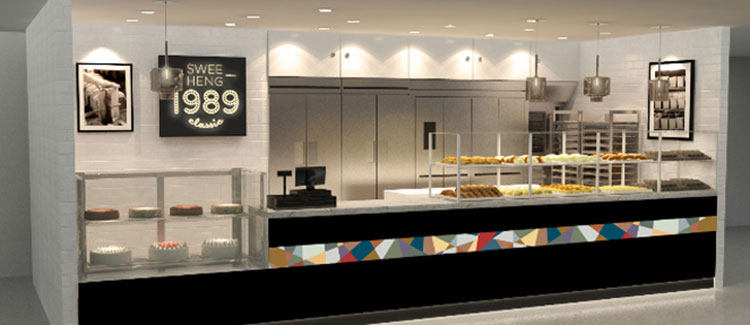
Swee Heng Bakery is one of the oldest bakery chain in Singapore. Established in 1989 with a humble 650 sq ft shop with 5 staffs, it has now expanded to 21 bakery outlets with a strength of 250 staffs and 15,000 sq ft factory in Senoko Crescent. With its rich history, it was natural and almost necessary for us to angle the brand design towards emphasising the experience Swee Heng Bakery has in the baking industry. This new branding of Swee Heng attempts to bring out the nostalgia atmosphere of the 1980s. They ride on a thematic approach of a flashback in time while serving delicious bread we are so familiar with in an alternative spectrum of 80s modernity.
Scopes of work:
Brand Positioning | Brand Logo | Brand Identity | Interior Design Concept | Environmental Graphic | Packaging Design
Market:
Singapore
bakery brand design: Home’s Oven
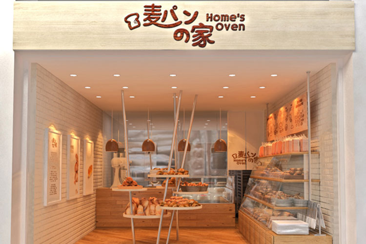
Home’s Oven is a bakery specializing in bread baked with natural yeast. With the emphasis on this natural process of baking; resulting in much artificial ingredients such as preservatives, colouring and flavouring heavily reduced. Home’s Oven strives to provide their consumers the healthier bread choice. Home’s Oven, as its name suggests, aims to give a cosy and heartwarming impression to its consumers. Created with rounded fonts, the logo adopts the very basic elements of design, to reiterate the essence of its products; wholesome and natural.
Scopes of work:
Brand Name Creation | Brand Logo | Brand Identity | Interior Design Concept | Environmental Graphic | Packaging Design
Market:
Singapore
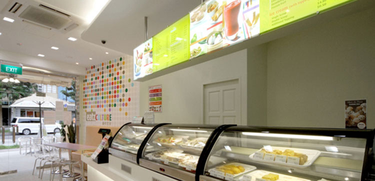
café brand design: Eatzculture
is a trendy eatery located in the heart of Tanjong Katong. It serves a wide array of food – from sesame ball, curry puff and steamed kueh to French pastries, tarts and muffins. The drinks range from espressos to Italian sodas. The challenge here was to convey a sense of tradition and modern feel in our design of eatzCULTURE’s corporate identity. To portray the eatery as a hip and fun hangout, we applied vibrant colours and zestful graphics to its interior and logo.
Scopes of work:
Brand Name Creation | Brand Logo | Brand Identity | Interior Design Concept | Environmental Graphic | Packaging Design
Market:
Singapore
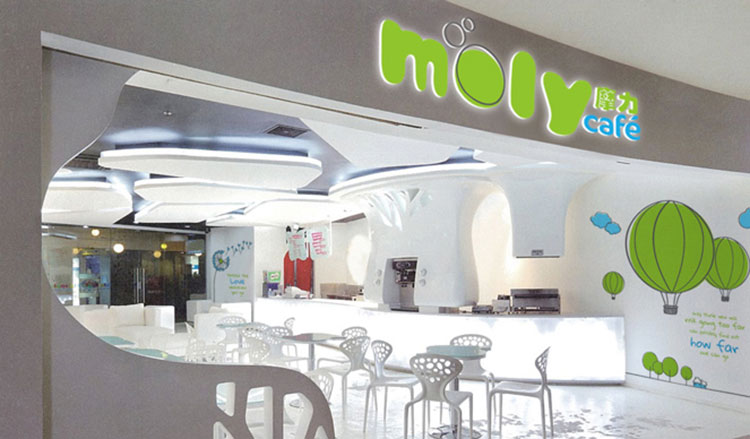
café brand design: Moly café
moly café is a new concept store selling bubble tea. The clean interior creates a serene and cozy environment, inviting one to enjoy the moment while sipping on a cold beverage. The graphic illustrations give a unique and distinctive feel. Let Moly café take you on a rejuvenating journey and discover life’s pleasures!
Scopes of work:
Brand Logo | Brand Identity | Interior Design Concept | Environmental Graphic | Packaging Design
Market:
Singapore
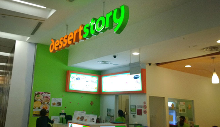
food brand design: Dessert Story
is born out of two childhood friends and their love for traditional chinese desserts. And not just delicious and mouth-watering oriental desserts, Dessert Story also offer asian fusion desserts to provide a wide range of choices to cater to your taste. Clean and friendly, Dessert Story is conceptualised from its logo to store design to be refreshing and inviting.
Scopes of work:
Brand Name Creation | Brand Logo | Brand Identity | Interior Design Concept | Packaging Design
Market:
Singapore
food brand design: Happy Veg
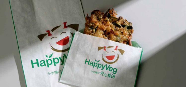
was a restaurant with a dated look. To give it a young image, we incorporated the cheerful look of a girl to its logo. Japanese characters were also added to reflect the brand’s roots. For the colours, we used unique hues of gold and green, blending them carefully so they complement each other and create a modern feel. We also coordinated new images for its speciality dishes, to make their menu look more enticing.
Scopes of work:
Brand Logo | Packaging Design
Market:
Singapore
food brand design: Tong Heng concept shop
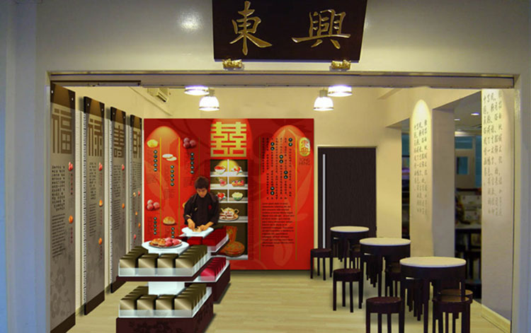
Chinese confectionary is well-known for its tasty, traditional pastries. They faced the problem of having an ill-defined corporate identity. We stepped in to re-design their logo, giving it bolder hues of gold and red, finished off with clean topography. For stronger branding, we renamed their biscuits, using words like “prosperity” and “good fortune” to enhance consumer-appeal. On the shop front, we modernised the interior by printing Chinese tales of traditional pastries on glass.
Scopes of work:
Brand Logo | Brand Identity | Interior Design Concept | Packaging Design
Market:
Singapore
food brand design: Dragon Brand Bird’s Nest
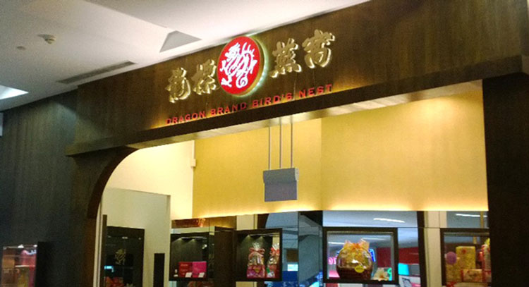
The aim was to revamp and uplift the design of the logo, giving it a makeover to inject new life to the brand. With the overcrowding of elements in the circular stamp, the old version was visually too heavy. The revamped version boasts a much simplified design. To retain the essence of the Dragon Brand, the dragon is imprinted on a pearl for a dose of prosperity. The dragon illustration was refined for a more intricate look.
Scopes of work:
Brand Logo Upgrade | Brand Identity | Packaging Design
Market:
Singapore
fruit brand design: Amayi
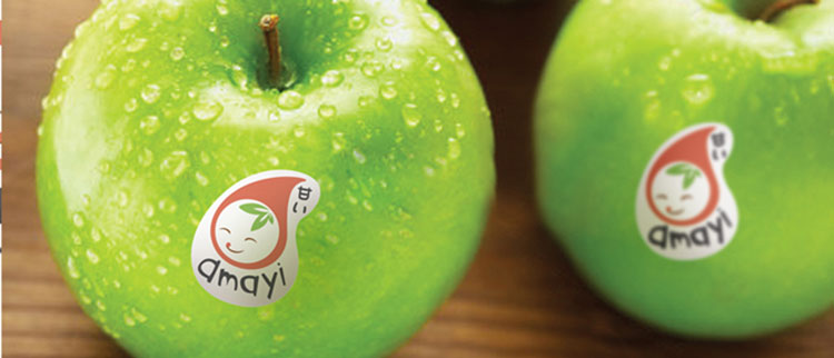
Amayi is the latest fruit brand from BeeSeng, a well know food distributor in Singapore market. Orient Design approach the brand from a fresh perspective. Amayi in Japanese means Sweet, therefore we were inspired by Japanese cheerful culture and came up with the mascot solution. The Japanese style mascot helps BeeSeng express the brand image; young, fresh and lively.
Scopes of work:
Brand Logo | Brand Identity | Packaging Design
Market:
Singapore
service & event brand design: Ladyfinger
the brand design is to portrait the concept of sanctuary for sheer indulgence and pampering. The red colour gives the logo a high fashion touch.
Scopes of work:
Brand Logo | Brand Identity | Interior Design Concept | Environmental Graphic
Market:
Singapore

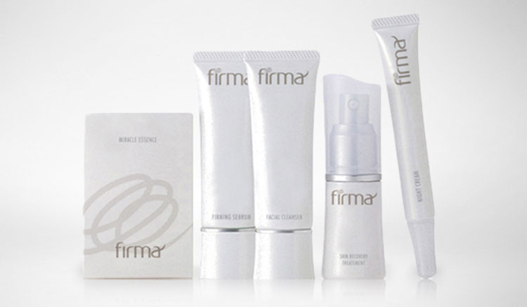
service & event brand design: Firma
Inspired by collagen, the most important ingredient behind soft, supple skin, the concept of Firma’s interior design is fluidity. The white and grey typography gives the logo a clean and classy treatment while projecting a sense of avant-garde serenity. The circular loop motif is inspired by the triple helix found in the composition of collagen.
Scopes of work:
Brand Logo | Brand Identity | Interior Design Concept | Packaging Design
Market:
Hong Kong
event brand design: French Festival Voilah!
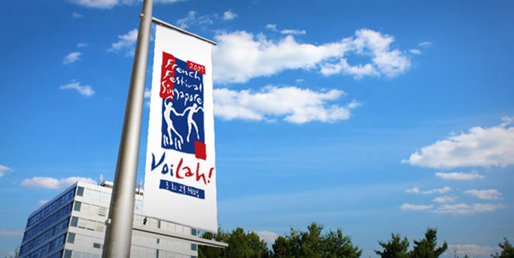
Organised by the Singapore French Embassy, the Singapore French Festival, Voilah!, needed an event logo. In our design, we drew inspiration from the paintings of renowned French artist Henry Matisse. Using strong silhouettes resembling Matisse’s iconic paper-cut figurines, we created a logo free of typical French symbols. Our aim was for the logo to speak to the French community in Singapore, and touch their hearts.
Scopes of work:
Brand Logo
Market:
Singapore
